
New Logo, New Look: Why We Rebranded Forge & Figures
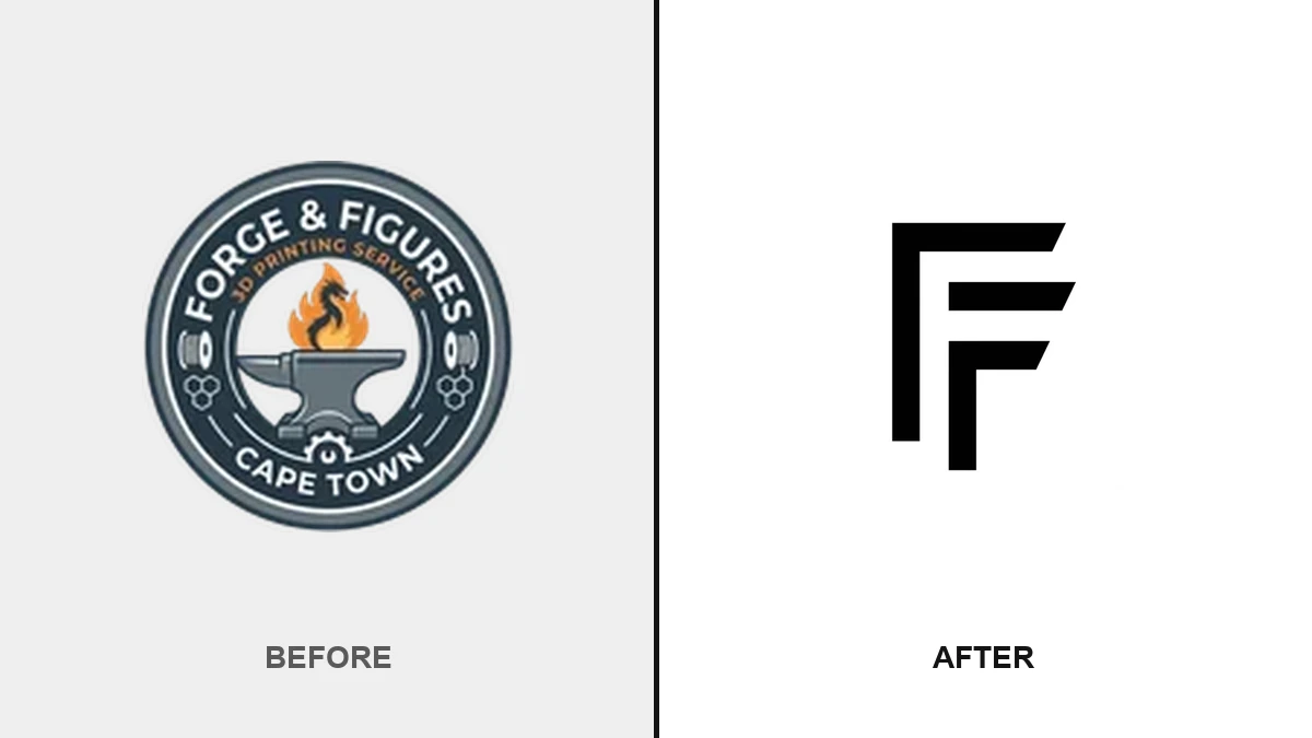
If you've visited the site in the last little while, you'll have noticed something's different. The navy circular badge with the anvil and flame is gone, and in its place is a flat, two-tone "F" mark. That wasn't just a logo swap — it kicked off a small rebrand across the whole site.
Out with the badge
The old logo did its job: a classic circular badge, anvil in the middle, "Forge & Figures" wrapped around the edge. It looked like a workshop crest, which made sense when we were still establishing what this business was. But a badge crammed with text stops working the smaller it gets — on a browser tab or a phone home screen, it was mostly just a blur of navy.
In with the mark
The new logo is two overlapping "F"s built from flat, angled bars — no text to shrink into mush, no fine detail to lose at favicon size. It reads clearly whether it's a 16px browser tab icon or the header on a 4K monitor, which was the actual problem we needed to solve.
Why the whole site changed color
A new mark sitting on the old palette would've looked like an afterthought, so we didn't stop at the logo. The warm ember-orange accent that ran through buttons, links, and highlights across the site is gone, replaced by a flat black-and-white palette that actually matches the mark — black accents on light backgrounds, white on dark. We also sharpened up the corners on buttons, cards, and tags site-wide, trading the soft, rounded pill shapes for something crisper that echoes the mark's angular cuts.
What didn't change
The workshop, the printers, the people answering your WhatsApp messages — all exactly the same. This was a coat of paint on the storefront, not a change to what's behind the counter. Pricing, turnaround, materials, all unchanged.
Got a project in mind?
New look, same studio. If you've got something you'd like printed, send us a WhatsApp and let's talk about it.